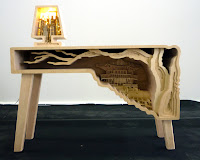
woohoo!
Daily, Monthly, Yearly! For all of you wondering what DMY stands for. (I asked, no body knew). This is the annual (super cool) Berlin design festival. There are satellite exhibitions happening too, but I missed most of them except for one (the most important one). Anyway I hung out with super cool people the other night and I got an entrance pass from my old internship. I was so so excited, I stayed up extra late the night before to plan out and draw maps for all the things to see outside of DMY. In the end, well, I found a playground instead, took a nap, and watched the football game.
Paper folding lamp! My work is glowing in a window! claim to fame! hettlertullmann
DMY lasts for about a week, and small design studios gallery spaces and popup shops open up with limited edition wares. One of the satellites was by my previous internship, and they had a nice little vernissage with close friends and family.The themed material was paper, and we had exhibited it in Milan for Ventura Lambrate and now they've brought it back here. It was the first time I've seen the final product since prototyping so this was really neat!
1. purple girl with purple umbrella, 2. directions to DMY
I thought this was funny. It is also my stance on what I think is priority.
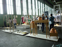
DMY is held at Tempelhof, an emptied out airhanger and showcases new, upcoming, local, and /or experimental design. It is much more exciting than a trade show, because it's much less commercial and the work is more fun and conceptual and the atmosphere is totally relaxed (or it's just Berlin). Anyway, it's a different feel altogether. I was advised by my friend that this years DMY was a bit disappointing and she just walked from one end to the other not really being attracted to anything so I had low expectations. Actually I figured since it wasn't going to be interesting, it would probably take me only an hour or so to get through it all (because I had a masterplan to follow to see everything DMY related in one day) but it took me more like almost three hours (to take pictures to show you of course). Nevertheless, I thought it was good. I've never been to anything like it! It's definitely different. Toronto could use one of these! It serves as a platform for young designers to reach a broad audience. Design laboratory.
1. Hanging on the hangar, 2. Station
Imagination playground, for "child directed, unstructured free play" (in NY) The kids are so excited they throw their clothes on the ground.
1. True scale! I thought the pieces were larger, 2. Paper molded lego, adream2012
Sustainable, imaginative, child's play
sustainable materials library. don't lick.
Instant Stories presents works of ten designers and studios from Berlin showcasing experimentation and narration in their objects as well as in their installations. The objects on show range from biodegradable cellulose lights to an umbrella table to chairs grown out of cultivated plants.
Heike Buchfelder, Figura Installation, like a flapper dress, out of feathers, it's strange indeed
Werner Aisslinger, Chair farming. Grow your own.
"Platz fur ideen" IKEA design awards
IKEA Foundation student design competition winners for the theme "Space for Ideas", The ten winners spend three semesters at the Design Centre in Lund, Sweden.
1. Bench of ends (I don't think this was part of the selection, but still witty!), 2. Nuno Chair, Emilia Lucht
Studio Montag Kocht! A very cute service design (dinner) concept. Look at the blocked doorway, I was obviously not invited to this cosy togetherness.
Landerfokus China.
China New Design, this section exhibits designs from China --furniture, fashion, graphic, and multimedia, and a collection of objects from everyday life and books, magazines, etc. They vacuum sealed all these artifacts and laid them on red-white-blue bags and labelled everything. An Anyway, many of the items were kitsch, and made references to Chinese heritage and traditions by reworking old objects or using traditional materials. Perhaps that is the way to show that these things are distinctly China design in that respect, sort of like how people assume that Canadian design is something that uses maple, moose, or plaid and references hockey.
"Revisit and Reflect", [...] will showcase the best of Chinese contemporary design and provide insight into the origins and the future of Chinese design. The exhibition will also offer a look at the broader panorama of Chinese daily life highlighting the evolution and rapid transformation of Chinese aesthetics,lifestyle, culture and society. We are, after al, a reflection of our times, and the design of our times is a reflection of who we are. Design is a mirror, a window into our lives.
One of the themes of this exhibition is expressed in the word "revisit". Taking design as our starting point, we can revisit daily life, and reflect on the changes that have taken place to our daily lives over the ages. By revisiting a single object, a work of art or design, we can better appreciate and understand the world as a whole. Much like classical Chinese philosophy, design gives us a way out of the chaos and confusion, the shades of ambiguity, the ups and downs of daily life. It offers us a foothold, a space in which to settle down and pursue the business of our lives.
China, in plastic.
1. Can anyone identify these figurines so I can covet them? 2. Rocking horse, Shi Chuan
Shadows in the sand
Comb armchair, Duo Xiang Studio
Designpreis der Bundesrepublik Deutschland = German Design Award? Lots of technical things for product, communication, and ecology with German features I could not understand.
Dutch thinking
Connecting Concepts: An exhibition about Dutch design mentality. Quite a nice mini exhibition, and interestingly placed side by side with the China New Design exhibition. The theme is technically the same, but the approach is entirely different. Instead of showcasing a collection of Dutch artefacts (because they are atypical), it was more about showing how they think differently and connect ideas... the grey stuff behind a good design that can enable. And well, at the end of the day, it is still their collective thought process behind a design that differentiates them from the crowd. And if you haven't noticed, they have this principle 'it's all about the process' written everywhere (in invisible ink) and sitting somewhere at the top, are conceptual thinkers who focusing not so much on the end product but an idea (ie. Droog...) before letting it come to fruition. Anyway, they wrote a nice intro to the exhibition and its concept and explained it better so here are the excerpts:
The exhibition deals with the possibilities of utilising design in even better ways in the development of new products and services. For design is always more than just the final result. In 'Connecting Concepts' we show how, by using design in the development of commissions, in the analysis of questions and problems, in the linking of innovation, knowledge and tradition, and in the latter stages in the development of products and services, it can yield an even more impressive economical, societal and cultural surplus value. Naturally, form is an important part of the final result, but it has long ago ceased to be the only way in which designers can contribute. What is crucial is the free exchange of knowledge and experiences in an open process in which commissioning clients and designers mutually inspire one another to new and adventurous undertakings.
Someone even made a video! An explanation of the idea, and a brief walkthrough
the oversized greenhouse tent
At the moment, I didn't get to stop and read everything, I just looked at everything and skimmed a bit and grabbed the english tear-aways. I'm reading them now and I wish I spent more time than I already did there. I also don't know to describe the exhibition without saying that it was 'cute'. I also am at a loss on how to share with you all this super cool information (the explanation of each project) I have in my hands : (
Seeing and Understanding
Two main essential qualities determine whether a project qualifies for inclusion in the 'Connecting Concepts'. The most important is the thought process behind a design. It has to have a fun, radical twist - some quality that turns the world on its head, you might say. In addition to that, it has to have substance. It should minimise the use of materials and expenditure of effort. And this will be accompanied by faster manufacturing or a strikingly clever idea. As we collected the designs, we observed the principle of 'intelligent laziness': processes were organised in such a manner that at a certain point everything would proceed of its own accord. This is often the goal of design.
The designs are positioned together in the same room, so that the visitor, on entering, immediately thinks: 'What kind of odd collection is this?' And that question invites him or her to go and look around. Then he or she will discover the diverse themes shared by the designs - such as 'Making things easier' (letting nature do the work), or 'Crossing over' (arriving at an innovation through applying a principle to something it wasn't originally intended for). [...] All themes are indicated by different colours of the text blocks and are the kind of link what we mean by a 'connecting concept'. That's not to say that the designs from different themes don't share other similarities. You'll discover them for ourself once you start looking around.
Fresh shoes, Marloes ten Bhömer. rotomolded synthetic rubber!
1. zZz is Playing: Grip, Roel Wouters / Moniker, 2. Rotating Clamp Meter, Tata Elxsi, 3. Button Blend, Anuj Sharma
1.Senz Umbrella, 2. Living Print, Joost Grootens
The Strand Bike, Studio Tjeerd Veenhoven. Build your own with carbon fibres soaked in epoxy resin (and a jig)...
gimp and bottlecaps. hello, kitty.
Vienna Design Week promo! Yes it works! Okay it sounds like someone is hacking your projects but still, it's fun!. watch. read at core77
1. Hand Warmer for public transport passengers, at "Perspective_s from Poznan" designs for public space, 2.Spotted shoe
1. David Trubridge, bamboo light kit, 2.Stern, raumfieber
1. Tallow, ontwerpduo, 2. Light Forest, ontewerpduo
1. wellpappen, KOLEKTWYW21; 2.'Beehive', Inew Konigsmann. It's super cute! Neukolln represent
afterimage_02, bomipark
1. Domestic landscape, Stephan Schulz; 2. "Look, the chair is sooo comfy, even I'm sitting in it"
KAHL-Kollektion, Milena Krais... natural hair?
1. hair hare heyre, 2. BluBs, atelier Belge
New Upholstery, Joohanna
Knitted army, Andrea Brena. "arm knitting"
encourage the user to retrace the steps of creative, making process
the HALF chair, studio sailing to mars, designed mainly for musical instrument players who are very attentive to their seated posture
"From this to these, progressive copying" Atelier Yea Yea
1. light out of lightbulbs, glow chandelier 2. part of a fictional picnic set, atelier yeayea. I really liked these!
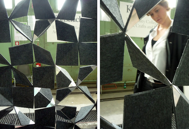
1. YFASMATIK by RTMIS, new felt folding technique; 2.Wooden, Peter Ronhke
dip! designsupermarket?
1. bowl, http://www.de-sign.cz; 2. Perspective console, Hyojin Shin
1. Drei, Mehrling, Christian Kim, multiple use of same parts, weighted shelf, 2. hands and feet, I don't know why I gravitate towards these things
"pompom couture" MYK
pompompoodle
3d printer.
food material?
1. "Objects rescoped", I know this exact image before it became a mirror, but I can't find it agh! 2. ha. seal
1. University of applied science, Aachen grad students work; 2. ditto, presentation
1. Gardening bag? 2. Universitat der Kunst, an exploration of porcelain and "self designed"
An excerpt of the 2012 Grad show exhibition for Berlin's Universitat der Kunste (in which I missed the full one > : ( )
1. Strezeminsky Academy of Fine Arts,There is a girl on the left sitting in a BEAR CHAIR , 2. We are Rundlauf, laser cut ping pong paddles
Ping pong merry go round
1. 90EUR glub glub; 2. 2012 Grad show exhibition for Berlin's Universitat der Kunste
This is a first year's class project! First years! at DMY!
1. pulp paper; 2. lamps
1. laser cut what you want, create Berlin, 2. Human rights anti-logo, Makerlab
slackers!
Burg Halle University of Art and Design, Candy collection, Kirstin Overbeck
My favourite kind of donut, envisioned as a stool. Thank you Kirstin.
1. Leseliege, Anne Rossner; 2. animal stools
Autonomous plants, Thijs Ewalts. Unfortunately the plants are not as smart as you think they are.
1. light glob. blob, 2. robot
partition
1. lazy lounge and a DJ; 2. Templehof
birdcage
I met up with my friend, and, surprise! We came across a funny looking playground. I took some pictures and moved along (there were a lot of satellites to cover!) but the giant triangle was kind of neat looking, no? Anyway, like I said, playgrounds that pop up are a sure sign of a good day!
penny castle
1. This guy is making candy! He's popping off pieces like there's no tomorrow; 2. Candy pattern roller! Like a playdough dream come true
Droog! <3 A gallery for Dutch art and design (DAD), but it seems that the majority of things inside are by Droog and Marcel Wanders/Moooi
1. I only dreamt of sitting on this bench until now. 2. True Colours and the love of patina
grease lamp
Like I said, the satellites sucked (except for DAD), so we gave up after seeing two and went home to take a nap before heading out again to catch the football game at another friend's house. If someone didn't stop me (ie, her) then I'd probably trudge through the rest of the satellites and be miserable lol.
Yeah, two playgrounds in one day. I'm a winner
1. fun, 2. fun, 3. fun
four kids can slide across that thing at the same time!
UEFA begins. Germany vs Portugal, game one (and won)!


No comments :
Post a Comment